K.I.S.S – Keep it simple stupid – is the best design principle ever because design without purpose is folly and simplicity is key to elegance.
A David and Goliath battle of avionics design
There’s a story I love about the development of the American F15 Eagle fighter jet (think Top Gun). At the time it had the most sophisticated avionics systems known to man, and the electronics for that system alone ran into the many hundreds of thousands of dollars. Let’s be clear here, this is an $80 million dollar aircraft, which also required a highly trained specialist ground crew to keep the mighty machines flying.
Conversely the Russian MiG 29, with its warty bumped nose, was the new kid on the cold war block, it was faster than the Eagle, more basic in design, cheaper, by a staggering $60M and was armed with heat seeking missiles that didn’t even need to be pointed at the enemy, boasting a greater range than those of the US ‘Sidewinder’ missiles arming the F15.
In the first few encounters, the F15 came off worse. Although it’s sophisticated enemy detecting avionics did their job and the pilot was well informed of the impending danger, ready to fire its Sidewinder, the MiG swept in at great speed, out manoeuvred the F15, made the kill shot and ran. Simple.
It was the Russian Sparrow attacking the American Eagle and not the other way around and it was many months before the Americans were able to observe the MiG at close quarter.
That ugly nose bump? Turned out to be a 180 degree round magnifying glass, just enough for the Russian pilot to roughly visually line up its target at a distance, fire and run. Add to that – as a 5-star US General commented – a couple of farm boys with a hammer could keep the MiG flying in battle conditions.
How’s that for sophistication?!
There has to be a purpose for design, I’m not saying the MiG was better than the Eagle, but they both approached the same design with differing outlooks, budgets and markedly different results.
How VIVID delivers on the KISS principle
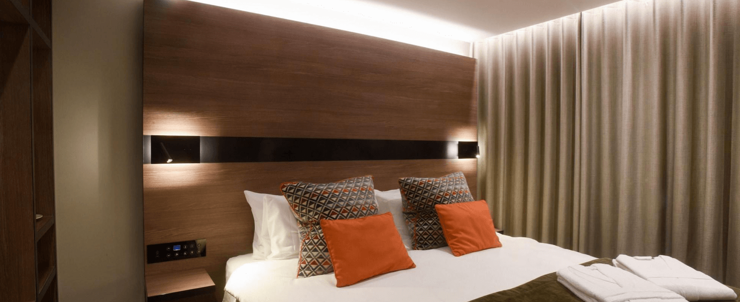
Everything we design at VIVID uses that KISS principle. It has usability, form and simplicity at its heart. If you look at a VIVID circuit board, it is elegant. As a user if you use one of our rotary dials, it will simply work: push it, rotate it, left or right and it will seamlessly blend the lighting design (see the guest rooms at the Vintry and Mercer as an example). It is chic in the virtue of its simplicity.
From a maintenance point of view it’s important to think who is likely to be looking after the product post commissioning? Usually it’s a ‘general’ maintenance person, so why make it more complicated than it needs to be? We have modular room controllers and lighting circuit modules that click together to form the backbone of the room and are colour coded for easy identification and replacement, by anyone.
So, simple to use, simple to install, offering a price differential and easy to maintain, what else do you want from good design?
To chat to us about the simplest guest room control products on the market, contact the VIVID sales team here.
Share this Post


